Want to know where interest rates may be headed? While there’s no way to predict the Federal Reserve’s next move with 100% certainty, the Fed has tools that investors and consumers can look to for insights. Among them is the Fed’s dot plot, which shows where the Fed’s policymakers see interest rates headed in the next few years.
This chart, which is published quarterly, doesn’t guarantee what’s to come — it’s not an official forecast. But some look to the dot plot for insights into what the Fed will do in the short term.
Here’s how to read the Fed’s dot plot and interpret it.
What is the Fed’s dot plot?
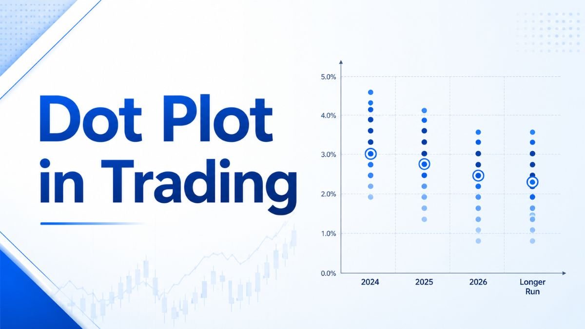
The dot plot is a chart that shows how the Fed’s top policymakers — members of the Federal Open Market Committee (FOMC) — think the Fed will change short-term interest rates over the next few years.
There are up to 19 dots on the Fed’s dot plot, each one representing the prediction of one anonymous member of the Federal Reserve Board. Those predictions are updated at each FOMC meeting based on a review of what’s happening with the economy and the outcomes each member believes are most likely in the future.
The Federal Reserve began publishing the chart in 2012 as part of an effort to increase transparency around its policies. The dot plot can now be found in the Summary of Economic Projections published each March, June, September, and December.
How to read the Fed dot plot
The Fed’s dot plot might look like a mess at first glance, but it’s easy to read with a little guidance.
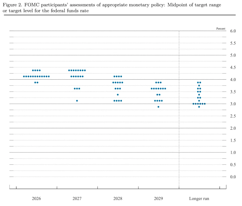
- Y axis (vertical): This shows the target percent for the federal funds rate. It represents the midpoint of the target range the policymaker thinks would constitute appropriate monetary policy.
- X axis (horizontal): You’ll see the rate predictions for the end of the current year, along with the end of the two upcoming years, and for the “longer run.” The longer-run projections show what each member believes will happen if there are no further shocks to the economy.
- Dots: Each dot represents one Fed policymaker’s projection. The dots are anonymous, so you can’t tell which projection belongs to which official.
Zooming out, how the dots are clustered can clue you into whether Fed officals are on the same page. For example, a tight cluster suggests policymakers have relatively similar views. A wide spread signals more disagreement about the appropriate path for rates.
What does the Fed dot plot tell us?
The dot plot only tells us what the FOMC members estimate will happen to interest rates in the future. But remember, they are educated guesses and they’re not necessarily accurate, since a variety of factors could change the ultimate outcome.
With that in mind, here’s how you might benefit from reading the Fed’s dot plots:
- Identify trends that indicate where interest rates are headed.
- Get a sense of whether the Fed’s members anticipate rate cuts or increases.
- Determine how much agreement there is between committee members over future policies.
- See if rates are expected to rise or fall, and prepare to shift your investment strategy as needed.
The latest September Fed dot plot marks a major shift in the Federal Reserve’s outlook. Following its latest meeting, the Fed raised the federal funds rate for the first time in three years, hiking it by 25 basis points to a range of 3.75%–4%. And this most recent dot plot has a median federal funds rate projection of 4.1% for the end of 2026, meaning another rate increase is expected before the year is over.
That’s a dramatic change from earlier this year, when no officials projected a rate hike and the median forecast still included a rate cut.
Fed dot plot benefits and limitations
Before using the Fed’s dot plot to help with your financial strategies, it’s important to acknowledge its limitations.
Historically, the chart is only minimally accurate at estimating rates with a one-year horizon and not at all accurate at predicting rates two or more years in advance. According to former Fed Chair Jerome Powell, “The dots are not a great forecaster of future rate moves,” and there is actually “no great forecaster.”
Why are tools like the dot plot so inaccurate? Mainly because the Fed only influences the economy, but doesn’t control it. The Federal Reserve adjusts interest rates based on economic conditions that are beyond its control and are sometimes completely unpredictable, such as inflation and unemployment.
In other words, any number of unforeseen events or policy changes could change the Fed’s short-term monetary policy. For example, tariffs or conflicts abroad could have a swift and significant impact on inflation.
On top of that, the dot plot showcases the disagreements between FOMC members about where the economy is headed and what corrective measures are necessary. And as you look further out on the chart, you’ll notice their forecasts differ even more.
So you’re interested in getting a sense of what will happen with interest rates, don’t put too much stock in the Fed’s dot plot, especially when it comes to predictions over a year out. Instead, you could be better off taking multiple data points and reports into consideration, including FOMC Meeting Statement, the yield curve, and the full quarterly Summary of Economic Projections.
The main purpose is transparency. It allows the Federal Reserve to communicate how its top policymakers view the future trajectory of short-term interest rates. This helps set expectations for financial markets, businesses, and everyday consumers without committing the Fed to an official policy promise.
No, every dot on the chart is anonymous. You cannot tell which dot belongs to Federal Reserve Chair Jerome Powell or any specific Regional Bank President. This anonymity allows policymakers to provide their honest, independent assessment of economic conditions without individual market scrutiny.
The dot plot is updated and released four times a year—specifically after the FOMC meetings in March, June, September, and December. It is included as part of the broader Summary of Economic Projections (SEP).
The dot plot reflects policymakers’ guesses based on current economic data. Because economy-altering factors—such as unexpected inflation spikes, geopolitical shocks, or employment shifts—are highly unpredictable, long-term rate forecasts often change drastically as new economic conditions emerge.
While the dot plot targets the federal funds rate (the overnight rate banks charge each other), shifts in the dot plot influence market expectations. When policymakers signal rate increases or cuts, commercial lenders adjust variable borrowing rates—such as credit cards, auto loans, and adjustable-rate mortgages—accordingly.

Manoj Sharma is a Senior Writer on the banking team at Tax Assistant. He provides information on budgeting, bank accounts, the banking industry, and other related topics. Using original data and methodologies, he helps you identify the best financial institutions, accounts, and products tailored to your needs. Manoj holds a degree in Journalism and Political Science from Syracuse University. All articles are strictly reviewed and fact-checked by our panel of expert Chartered Accountants, including CA Devendra Saini, CA Nikhil Khunteta, and CA Ankit Goyal